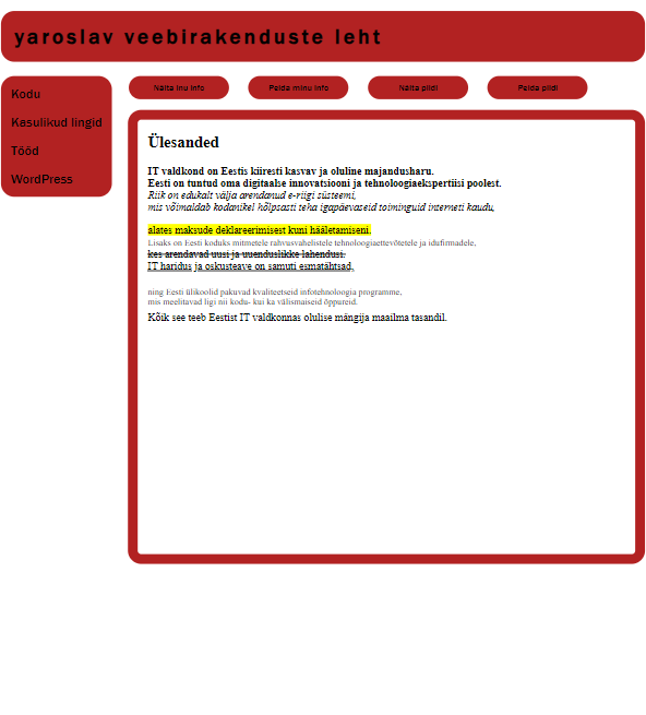
| Responsive Web Design (RWD) |
This design is adaptive, since all parameters and sizes in it are specified in percentages. Regardless of the device, its proportions will always be the same.

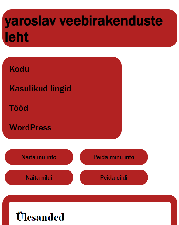
| Adaptive Web Design (ADW) |
This design is responsive because it has a condition that, depending on the window extension (device version) or screen, its corresponding parameters change.

My opinion
Adaptive web design, while effective, has its drawbacks. It’s tailored to specific devices, ensuring precise control. But this meticulous approach has limitations, especially in an ever-evolving digital landscape.
Adaptive design anticipates common screen sizes, optimizing content for various devices. This specialization ensures a seamless experience on desktops, tablets, and smartphones. But, the downside lies in its rigidity.
The meticulous device-specific control in adaptive design can become a hurdle. It requires constant updates to accommodate new devices. This can be resource-intensive and challenging for websites aiming for long-term adaptability.
Moreover, adaptive design might lead to inconsistencies. Different devices may display varying versions, causing potential confusion for users. This lack of uniformity can hinder the overall user experience.
Additionally, the design process for adaptive layouts demands extra effort. Designers must create and maintain specific layouts for each device category. This not only increases workload but also requires a deep understanding of diverse devices.
In summary, adaptive web design, with its precise control and tailored experiences, has cons. Its rigid nature, resource-intensive updates, potential inconsistencies, and increased design effort are factors to consider. It’s crucial to weigh these drawbacks against the benefits and evaluate whether adaptive design aligns with a website’s goals and resources.

